QR Code Customization: Add Colors, Logos, and Branding
Your QR code doesn’t have to be the same old black-and-white scramble of squares. You can make your code stand out by adding color, your brand logo, and more. Welcome to the ultimate playground for QR code creativity!
Whether you're looking to improve the look of your business cards or want a stylish code that pops on event posters, QRNow’s QR code generator is your new best friend.
How To Design Custom QR Codes With Color, Logos, and AI
Use the QR generator here on our site to make your own personalized code. With our AI-powered tool, you can enhance the design of your QR codes in just a few clicks.
The AI helps you optimize visual elements such as patterns, colors, and overall style, while keeping your QR code fully functional and scannable.
Here’s how you can make it happen:
-

1. Include your code’s content
Before personalizing your code, it’s important to add the information. Add a title for the code and the URL or file that is relevant to your code.
For example, if you own a restaurant, add the file of your menu to your PDF QR code.
-
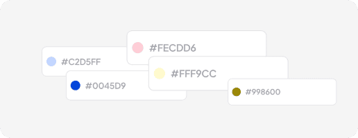
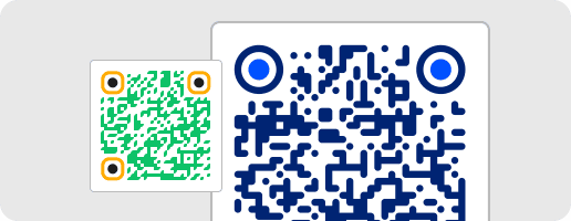
2. Select the colors for your QR code
Adding color to your codes not only makes them visually appealing, but can also align them with your brand identity. Let’s say you own a gym, and its colors are blue and orange. In that case, add those colors to your code
Our tool lets you select from a palette or input specific hexadecimal (hex) codes for precision in your colored QR code.
- You can use colors for:
- The frame
- The edges
- The background
- The QR code itself
Growing your brand identity is key; make sure your codes can help you with that by using the right colors.
-
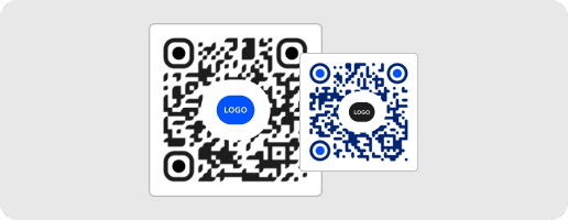
3. Enhance your QR code design with AI and a logo
A QR code with a logo in the center is a powerful marketing tool, allowing you to strengthen brand recognition by uploading and positioning your own logo within the design.
Placing your logo right in the center is a clever way to increase brand recognition.
If you want to make a QR code with a logo, you’ve come to the right place.
You can upload your own logo and integrate it into the design.
The AI helps refine and optimize the overall QR code design by adjusting patterns, styling, and composition, ensuring a visually appealing result that remains fully scannable.
-
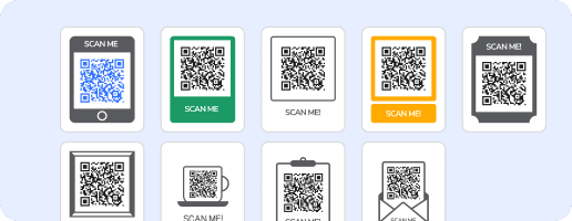
4. Add a frame
A frame is a fantastic way to draw attention to your QR code. It also improves scanability by keeping the quiet zone of the code intact.
As well as playing with adding QR code colors to your frame, you can add a call-to-action, like "Scan me". Choose from various styles to match your aesthetic or campaign mood.
-
5. Adjust your code’s edges
Smooth or sharp? Your QR code’s edges can change the overall feel of the design. Opt for rounded edges for a softer, friendlier look, or keep them sharp for a sleek, modern vibe.
Our tool lets you tweak these details in seconds to get the look just right.
Best QR Code Color Combinations
Choosing the right combination ensures both visibility and performance. Below are proven combinations with strong contrast ratios.
|
Foreground Color |
Background Color |
Contrast Ratio |
Best Use Case |
|---|---|---|---|
| Black | White | 21:1 | Universal use across print and digital |
| Dark Green | White | 7.5:1 | Eco brands and product packaging |
| Navy Blue | White | 8.6:1 | Corporate identity on professional business card designs |
| Dark Purple | Light gray | 6.8:1 | Event branding on invitation-based campaigns |
| Dark Red | White | 7.0:1 | Retail promotions and printed ads |
How To Change the Design of Existing QR Codes
Want a QR code with a logo in middle? No need to start from scratch! You can change the design of any dynamic codes you have created with QRNow.com.
To update your custom QR code logo, colors, or design on QRNow, follow these steps:
- Log in to your account and open the dashboard.
- Locate the code you want to change, click on the three dots, and then "Edit".
- Review the content of your code and make changes as needed.
- Redesign your code with AI or manually select the frame, pattern, colors, and upload your logo.
- Click "Finish."
Static QR codes can’t be changed once created, so you can’t edit these, but you can always design new ones using our tool.
Best Practices When Creating a Colored QR Code
Color customization improves visual appeal, but it must support scanning accuracy at every stage. Apply the following best practices to ensure your design remains both visually consistent and technically reliable across all use cases.
-
Choose high color contrasts
Always prioritize strong contrast between the foreground and background to ensure scanners can clearly detect the pattern. Dark colors such as black, navy, or deep green perform best when placed on light backgrounds like white or light gray.
Avoid using light foregrounds on dark backgrounds unless you have tested them extensively. Inverted designs reduce readability and often fail under low lighting or when scanned using lower-quality mobile cameras.
-
Meet contrast ratio requirements
Maintain a contrast ratio of at least 4:1 between the foreground and background to meet minimum scanning standards. For professional applications such as print, outdoor signage, or packaging, aim for a ratio closer to 7:1 or higher.
Lower contrast ratios increase the risk of scan failures, especially when glare, shadows, or poor lighting conditions are present. Strong contrast ensures consistent performance across different devices and environments.
-
Follow scannability guidelines
Ensure your design follows essential scannability rules, including clear module shapes, proper spacing, and sufficient size. Distorted or overly stylized elements can interfere with how scanners interpret the structure.
Use recommended QR code size and scaling standards for reliable scanning to ensure your design performs correctly across print materials, digital screens, and varying viewing distances.
-
Avoid busy backgrounds
Backgrounds with patterns, gradients, or images reduce contrast and make it harder for scanners to isolate the code. Even subtle textures can interfere with detection, especially when combined with colored designs.
Always place your QR code on a clean, solid background that allows the structure to stand out clearly. This improves scan speed and reduces errors across different lighting conditions and camera qualities.
-
Maintain a clear quiet zone
A quiet zone is the empty space surrounding the code, and it plays a critical role in detection. Maintain a clear, uncolored margin, typically four modules wide, around the entire design.
Removing or reducing this space can cause scanners to misinterpret the boundaries, especially when the code is placed near text, images, or other visual elements in your layout.
-
Use your brand’s color palette
Integrate your brand colors to maintain visual consistency across campaigns, but adjust tones when necessary to preserve contrast. Not all brand colors are suitable in their original form, especially lighter shades.
You can enhance recognition further by adding a logo using custom QR code designs with colors and logos for branding, as long as the core structure remains intact and scannable.
-
Test colors before printing
Always test your design in real-world conditions before finalizing it for distribution. Scan it using multiple devices, operating systems, and lighting environments to confirm consistent performance.
Follow practical QR code printing tips to avoid scan issues and print a sample version to check how colors appear on different materials and finishes.
Solving Common Challenges in QR Code Color Design
Color customization often introduces technical issues that reduce scan reliability. Identifying these problems early allows you to adjust your design before deployment.
Brand colors that look good but scan badly
Some brand color combinations lack sufficient contrast, especially when similar tones are used together. This reduces pattern visibility and makes it harder for scanners to detect the code accurately.
Adjust brightness or saturation, or switch to a darker foreground while keeping your visual identity intact. It also helps to review common QR code scanning problems before publishing so you can catch issues early.
Decorative backgrounds that interfere with detection
Decorative elements such as gradients, textures, or images can blend into the code and hide its structure. This makes it difficult for scanners to separate the code from its background.
Place your QR code on a clean, solid color surface and keep surrounding visuals at a safe distance. This ensures the pattern remains clear and improves scan speed across different devices and lighting conditions.
Over-customization that weakens readability
Excessive customization, including rounded modules, shadows, or complex shapes, can distort the structure of the code. This reduces accuracy and increases the chances of failed scans.
Limit design changes to safe areas and keep the core pattern simple and consistent. Focus on clarity first, then apply branding elements without compromising the integrity of the code.
Printed colors that look different from the screen version
Colors often shift during printing due to ink absorption, paper type, and lighting conditions. What looks clear on screen may appear dull or low contrast once printed.
Always print a test sample and scan it in real conditions before full production. This helps confirm that your chosen colors maintain contrast and remain fully scannable across different environments.
FAQs
Are colored QR codes effective?
Toggle faqs
Yes, colored QR codes are effective when designed with proper contrast and structure. They improve visual appeal and help align your campaigns with your brand identity, which can increase engagement.
However, performance depends on maintaining a clear distinction between foreground and background. If contrast is too low, scanning accuracy drops.
When you balance branding with technical requirements, colored designs perform just as reliably as standard black and white versions across print and digital channels.
How do I change the background color of my QR code?
Toggle faqs
To change the background color, open your saved QR code in the generator and locate the color settings. Select a new color that maintains strong contrast with the foreground pattern. Avoid dark backgrounds unless the foreground remains clearly visible.
After applying the new color, preview the design and test it on different devices. This ensures the updated version scans consistently before you download or publish it across your marketing materials.
Can I invert the colors of a QR code?
Toggle faqs
You can invert the colors, but it is not recommended for most use cases. Light foregrounds on dark backgrounds reduce contrast, making it harder for scanners to detect the pattern accurately. This becomes more noticeable in low-light environments or on lower-quality cameras.
If you choose to invert colors for branding purposes, test the design thoroughly across multiple devices and lighting conditions to confirm that scanning remains reliable before using it in production.
What is the contrast ratio for a QR code?
Toggle faqs
The contrast ratio measures the difference between the foreground and background colors. A minimum ratio of 4:1 is required for basic scanning reliability, but higher ratios are strongly recommended for professional use. For print, outdoor placements, or high-traffic campaigns, aiming for 7:1 or higher improves performance.
Strong contrast ensures the pattern remains visible under different lighting conditions, screen types, and camera qualities, reducing scan failures and improving user experience.
Do QR codes need to have a white background?
Toggle faqs
QR codes do not require a white background, but the background must be light and uniform to maintain strong contrast. White is commonly used because it provides the highest level of visibility and consistency across environments. Light gray or soft pastel tones can also work if the foreground remains significantly darker.
Avoid dark or complex backgrounds, as they reduce readability and increase the likelihood of scanning errors, especially in real-world conditions.
How do I make a QR code with a transparent background?
Toggle faqs
To create a transparent background, select a format that supports transparency during export. PNG is commonly used because it preserves quality while allowing the background to remain clear.
You can generate and download transparent designs using QR code download formats with PNG transparency support. Before using it, ensure the surface where it is placed provides enough contrast for reliable scanning.
